|
AbleCommerce provides seven types of category display pages. Each category display page is defined by a Layout and Theme. They are assigned to categories in your store.
To View or Change Category Page Assignments
-
From the Manage Category page, or from the top-menu, go to Website > Category Pages.
-
Click the linked number counter.

-
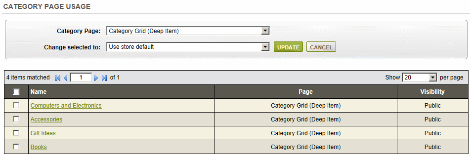
You should be viewing the Category Page usage report. When a category page is directly assigned to any category in your store's catalog, it will be shown from the category page usage manager.
-
From this page, you can select any Category Page and the results (if any) will appear in the bottom grid as shown in the above example.
The matching results that are shown include the category name linked to the editing page, the currently used category display page, and the visibility setting for the category.
-
If desired, you can check one or more boxes in the first column and apply a different category display page by selecting one from the Change Selected To box.
-
Click the UPDATE button to apply the change.
-
To return to the Manage Category Page, click the CANCEL button.
Changing a Category Display Page
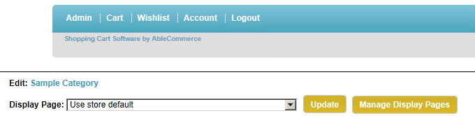
There are other ways you can change the Category Page assignment. If you are logged in as an administrator, you can view and change the display page assigned to any category by previewing the storefront. Simply, scroll down to the bottom of any category page (below the footer), and you should see an area to edit.
-
Next to Edit, you can click the linked category name to go directly to the Edit Category page.
-
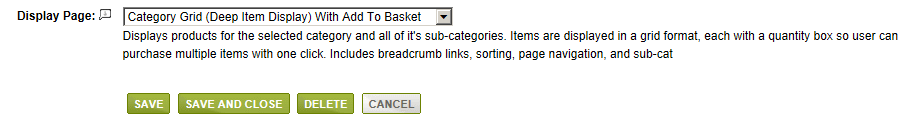
At the bottom of the Edit Category page, there is a setting to change the Display Page.
-
When finished, click SAVE.
-
Even easier, you can select a new Display Page directly from the storefront and click UPDATE. It will be applied to this category only.
-
You can click the Manage Display Pages button to return to Manage Category Pages administration.
Editing a Category Page Display
-
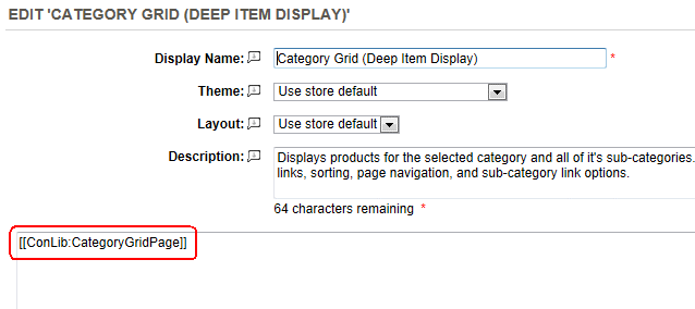
To modify a product page, go to Website > Category Pages.
-
Click on the EDIT icon in the Actions column.
-
In the last field, you will see the ConLib reference (circled in red). Using the properties of the control, you can change how information will be displayed on the page.
-
Use the examples below to see which properties are available on how they will be shown on the page.
-
Change the Usage properties as needed.
e.g. [[ConLib:ProductPage OptionsView="DROPDOWN" ShowVariantThumbnail="False" ShowAddAndUpdateButtons="False"]]
-
Click the SAVE button when finished.
Sample Category Page Displays
|
TIP:
|
In the list below, the Control Name is listed with an example output in the store. The controls will each have additional properties that allow for easy customization. The controls are located in the \ConLib\ folder and can be changed as needed.
|
|
|
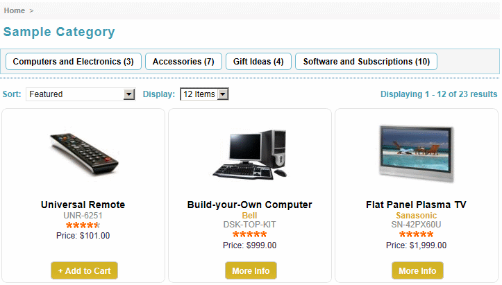
Category Grid (Deep Item)
Displays products for the selected category and all of it's sub-categories. Items are displayed in a grid format with breadcrumb links, sorting, page navigation, and sub-category link options.
Summary: The defualt category page that displays products in a grid format. Allows customers to browse your catalog.
Usage: [[ConLib:CategoryGridPage Cols="3" PagingLinksLocation="BOTTOM" DisplayBreadCrumbs="True" DefaultCaption="Catalog"]]
Properties:
- Cols
- The number of columns to display
- PagingLinksLocation
- Indicates where the paging links will be displayd, possible values are "TOP", "BOTTOM" and "TOPANDBOTTOM".
- DisplayBreadCrumbs
- Indicates wheather the breadcrumbs should be displayed or not, default value is true.
- DefaultCaption
- Caption text that will be shown as caption when root category will be browsed.
|
|
|
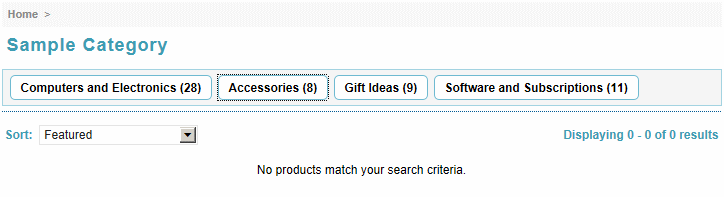
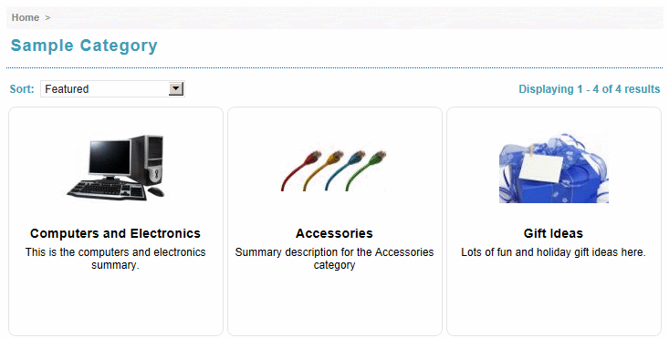
Category Grid (Shallow Item Display)
Displays products for only the selected category. Items are displayed in a grid format with breadcrumb links, sorting, page navigation, and sub-category link options.
Summary: A category page that displays all products in a grid format.
Usage: [[ConLib:CategoryGridPage2 Cols="3" PagingLinksLocation="BOTTOM" DisplayBreadCrumbs="True" DefaultCaption="Catalog"]]
Properties:
- Cols
- The number of columns to display
- PagingLinksLocation
- Indicates where the paging links will be displayd, possible values are "TOP", "BOTTOM" and "TOPANDBOTTOM".
- DisplayBreadCrumbs
- Indicates wheather the breadcrumbs should be displayed or not, default value is true.
- DefaultCaption
- Caption text that will be shown as caption when root category will be browsed.
In this first example, we are looking at the Sample Category. There are no products assigned to this specific category, so this screenshot represents what a user might see. With this display page, only items at the current level will be shown.
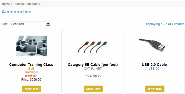
In this next example, we are looking at the Accessories sub-category -
|
|
|
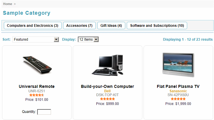
Category Grid (Deep Item Display) With Add To Basket
Displays products for the selected category and all of it's sub-categories. Items are displayed in a grid format, each with a quantity box so user can purchase multiple items with one click. Includes breadcrumb links, sorting, page navigation, and sub-cats.
Summary: Category Grid with Add To Cart Option. The category page that displays products in a grid format. Allows customers to browse your catalog, with options to directly add your products to cart and specify the quantity.
Usage: [[ConLib:CategoryGridPage3 Cols="3" PagingLinksLocation="BOTTOM" DisplayBreadCrumbs="True" DefaultCaption="Catalog"]]
Properties:
- Cols
- The number of columns to display
- PagingLinksLocation
- Indicates where the paging links will be displayd, possible values are "TOP", "BOTTOM" and "TOPANDBOTTOM".
- DisplayBreadCrumbs
- Indicates wheather the breadcrumbs should be displayed or not, default value is true.
- DefaultCaption
- Caption text that will be shown as caption when root category will be browsed.
|
|
|
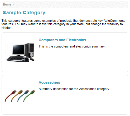
Category Grid (Shallow Item Display) With Category Data
Displays categories, products, webpages, and links for only the selected category. Items are displayed in a grid format with breadcrumb links, sorting, and page navigation.
Summary: A category page that displays all contents in a grid format. This page displays products, webpages, and links.
Usage: [[ConLib:CategoryGridPage4 Cols="3" MaximumSummaryLength="250" PagingLinksLocation="BOTTOM" DisplayBreadCrumbs="True" DefaultCaption="Catalog"]]
Properties:
- Cols
- The number of columns to display
- MaximumSummaryLength
- Maximum characters to display for summary
- PagingLinksLocation
- Indicates where the paging links will be displayd, possible values are "TOP", "BOTTOM" and "TOPANDBOTTOM".
- DisplayBreadCrumbs
- Indicates wheather the breadcrumbs should be displayed or not, default value is true.
- DefaultCaption
- Caption text that will be shown as caption when root category will be browsed.
NOTE: This category display page should only be used for a category having small number of direct child objects.
|
|
|
Category Details Page
Displays categories, products, webpages, and links for only the selected category. Items are displayed in a left-aligned, row format, with descriptions and images.
Summary: A category page that displays all contents of a category with summary description in a row format. This page displays products, webpages, and links.
Usage: [[ConLib:CategoryDetailsPage DefaultCaption="Catalog" DefaultCategorySummary="Welcome to our store." PagingLinksLocation="BOTTOM"]]
Properties:
- DefaultCaption
- Caption text that will be shown as caption when root category will be browsed.
- DefaultCategorySummary
- Summary that will be shown when root category will be browsed.
- PagingLinksLocation
- Indicates where the paging links will be displayd, possible values are "TOP", "BOTTOM" and "TOPANDBOTTOM".
|
|
|
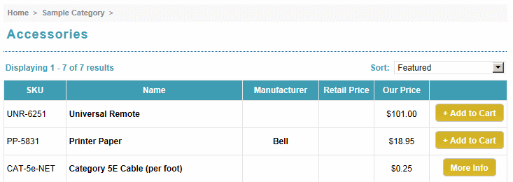
Category List
Displays products for only the selected category. Items are displayed in a row format with columns for SKU, manufacturer, and pricing. Includes breadcrumb links, sorting, page navigation, and sub-category link options.
Summary: A category page that displays all contents of a category in a simple list format. This page displays products, webpages, and links.
Usage: [[ConLib:CategoryListPage PagingLinksLocation="BOTTOM" DisplayBreadCrumbs="True" DefaultCaption="Catalog" PageSize="20"]]
Properties:
- PagingLinksLocation
- Indicates where the paging links will be displayd, possible values are "TOP", "BOTTOM" and "TOPANDBOTTOM".
- DisplayBreadCrumbs
- Indicates wheather the breadcrumbs should be displayed or not, default value is true.
- DefaultCaption
- Caption text that will be shown as caption when root category will be browsed.
- PageSize
- Number of items to display on one page.
|
|