Responsive Theme
AbleCommerce Gold R10+ includes a Responsive Theme built around the popular Responsive Web Design (RWD). RWD is a relatively new approach to creating a single website that is designed to work with all different types of computer screens including personal desktops to small phone devices. Using RWD can save you significant resources and money because the website owner can focus on creating one website instead of one main website and a secondary mobile website. With the mobile devices now being used in greater numbers than ever before, it is a wise choice for any merchant to use the Responsive theme provided as an out-of-the-box solution.
A requirement when creating a Responsive Website Design, means that you must first create pages that have HTML structured for a mobile device, then you use CSS styles to define how it should look on larger screens. A website that uses Responsive Design can adapt the layout to any device by using fluid, proportion-based grids, flexible images, and CSS3 media queries, which allow the page to use different CSS style rules based on the width of the browser. It is a replacement to using a separate mobile site. In other words, you don't have to worry about designing and maintaining a separate mobile website now. The Responsive designed website will eventually be a standard form used for all sites.
Google announced that on April 21, 2015, that they will begin using new algorithms to rank your website for being mobile friendly, and will rank these websites higher in search results when a mobile device is used. Now, more than ever, it is important to design a mobile friendly website.
Responsive Bootstrap Themes
AbleCommerce Gold R10+ uses Bootstrap to create a Responsive Website Design.
Bootstrap is the most popular HTML, CSS, and JavaScript framework for developing responsive, mobile-first web sites. Bootstrap easily and efficiently scales your websites and applications with a single code base, from phones to tablets to desktops with CSS media queries. With Bootstrap, you get extensive and beautiful documentation for common HTML elements, dozens of custom HTML and CSS components, and awesome jQuery plugins.
Bootstrap was created by two developers, Mark Otto and Jacob Thornton, working for Twitter. In January, 2012, Bootstrap 2 was announced with support for responsive design components. Now, today, Bootstrap is the preferred front-end framework used by developers across the world. For more information, please see http://getbootstrap.com/
Copy the Bootstrap Responsive Theme
Before beginning any theme customization, you should make a copy of the original theme first.
-
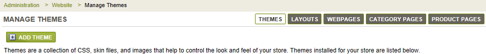
From the Themes page, or from the top-menu, go to Website > Themes.
-
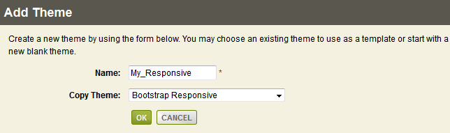
Find the ADD THEME button and click it to view a pop-up form.
-
In the Name field, enter a name for your new theme. The theme name cannot include any special characters or spaces.
IMPORTANT: The new name must end with the word "Responsive" to ensure that the code will recognize the theme as Responsive and CSS applied accordingly. -
Select the "Bootstrap Responsive" theme to make a copy from.
-
Click the OK button, and wait a moment for the theme files to be copied to their new location. The new theme will be created the \App_Themes\ folder.
-
At the bottom of the page, click the CHANGE DEFAULT button. Then select the new theme you just created.
Editing the Bootstrap Responsive Theme
There are three options for editing the CSS for the Bootstrap Responsive theme. Each option is described in the following sections. We recommend that you use the "custom.css" file which is included by default in AbleCommerce Gold 11 and higher. This allows you to easily apply upgrades because any stylesheet over-rides will be retained in your custom file.
OPTION 1: EDIT THE THEME USING A 3RD-PARTY BOOTSTRAP EDITOR
In order to customize the responsive theme, you will have to work with .LESS. This is a CSS stylesheet preprocessor. Currently, the responsive theme has a "style.less" file which, when compiled with LESS, generates the required stylesheet. Any LESS editor can be used to modify and compile the file, but we recommended that you use Visual Studio with the Web Essentials plugin.
If you do not wish to use a special LESS editor, there is another option which works well. See the last section "Using a Custom StyleSheet to over-ride Style.Less"
Bootstrap is very popular, but it encourages a bad practice which is to use bootstrap classes in HTML. This is not a semantic way since it makes your HTML bootstrap dependent. We chose a different approach where we extended Bootstrap to use the AbleCommerce class names with it's style. Bootstrap is built around LESS, so we just used all the LESS source of Bootstrap, extended our custom style.less from it, and then relabeled styles according to css classes we already had in the HTML pages. This made it so we could stay compatible with other themes, and also allow existing customers to upgrade to this version without having to redo all their style changes.
In order to customize the Bootstrap Responsive stylesheet you will have to do the following:
-
Install Web Essentials plugin in for Visual Studio
-
Download Bootstrap source code "LESS" package and keep under the responsive theme folder.
-
Make changes to Style.less file.
-
Web Essentials will automatically update style.min.css file and you should be able to see updates.
OPTION 2: EDIT THE THEME USING THE ABLECOMMERCE BUILT-IN THEME EDITOR
This option is for the novice merchant who has no ability to access the stylesheet files directly through the server or FTP.
To edit the Bootstrap Responsive theme using AbleCommerce:
-
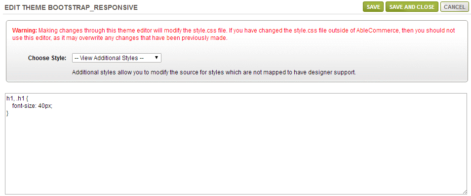
Go to the Website > Themes page. Click the EDIT icon next to the Bootstrap Responsive theme or the copy of this theme that you should create before beginning.
-
To create a custom over-riding style, find the selection named Choose Style.
-
From the select list, choose style "-- View Additional Styles --".
-
A blank text editor will be displayed as shown in the example below.
-
Enter some over-riding custom stylesheet code.
-
Click SAVE or SAVE AND CLOSE when finished.
The contents of the "custom.css" file are changed. You can use the Theme Editor to view these changes. However, if you are using the built-in Theme editor within AbleCommerce, it is best to continue using the same editing method instead of changing the files manually.
OPTION 3: USING A CUSTOM STYLESHEET TO OVER-RIDE STYLE.LESS
This technique easily allows a person to edit the CSS code without needing to have a special editor. This will require that you have a plug-in so you can view the CSS code on any page. We recommend using FireFox and installing either FireBug or Inspector.
CREATE THE OVER-RIDING CSS FILE << this step is only required for AbleCommerce Gold R11 and earlier builds
Step 1) Edit the style.skin file for your Responsive theme. e.g. \App_Themes\Bootstrap_Responsive\style.skin
Step 2) Add the following line at the end of the list of css files as shown below:
<cb:StylePlaceHolder runat="server">
<cb:Style runat="server" CssUrl="style.min.css" TargetMedia="All" DeviceConstraint="Standard"></cb:Style>
<cb:Style runat="server" CssUrl="footable.core.css" TargetMedia="All" DeviceConstraint="Standard"></cb:Style>
<cb:Style runat="server" CssUrl="print.css" TargetMedia="Print" DeviceConstraint="Standard"></cb:Style>
<cb:Style runat="server" CssUrl="jquery/jqueryui.css" TargetMedia="All" DeviceConstraint="Standard"></cb:Style>
<cb:Style runat="server" CssUrl="mobile.css" TargetMedia="All" DeviceConstraint="Mobile"></cb:Style>
<cb:Style runat="server" CssUrl="custom.css" TargetMedia="All" DeviceConstraint="None"></cb:Style>
</cb:StylePlaceHolder>
Step 3) Then create a new empty text document called custom.css and place it in the same directory.
Since the custom.css file is included last in the list it will overwrite the values in the previous css sheets.
ADD YOUR CUSTOM CSS
Step A) Open the AbleCommerce website and view the page that you wish to change. In the example below, we are going to view the store header and change the link color from blue to black.
Step B) Using your browser add-on, such as Inspector or Firebug, select the area or text that you wish to change. Note the style code in the right-bottom section of the screenshot below.
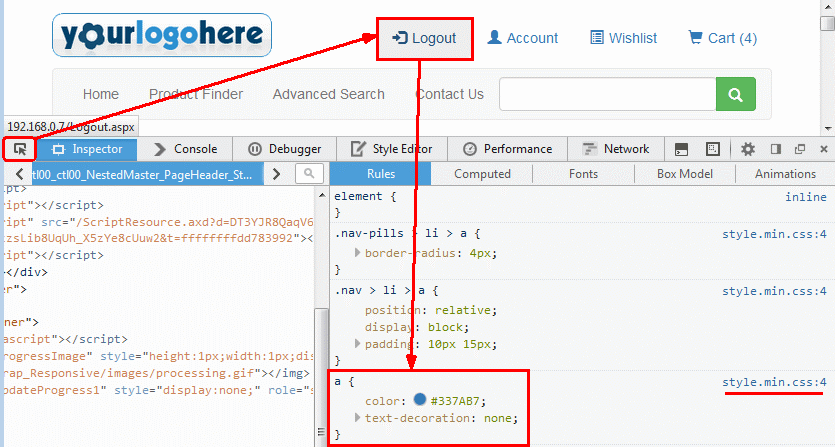
Step C) Open your custom.css file and copy the section from the screen directly into the file. Make sure to include the beginning and ending brackets { } as well as the style element.
a {
color: #000;
text-decoration: none;
}
Step D) Make the change and save. In this example, we have changed the color blue (#337AB7) to black (#000)
Refresh the page and you should see your changes.
If you are unsure of the style change to make, then simply edit the information on the preview screen before adding it to the custom.css page. Once you have it looking how you want, then copy the code over.
Special Layout for the Bootstrap Responsive Theme
The Responsive theme is compatible with all standard AbleCommerce layouts: OneColumn, LeftSideBar, RightSideBar, ThreeColumn, Category, and Product.
There was one issue when working with the LeftSideBar layout. All left column controls would be displayed before the main page content. So, we wanted to create a special layout called "LeftSideBarResponsive". This will allow the main content area to be displayed before the content in the left column when viewed on smaller devices.
Let's take a look at some examples of the home page using the "LeftSideBarResponsive" layout.
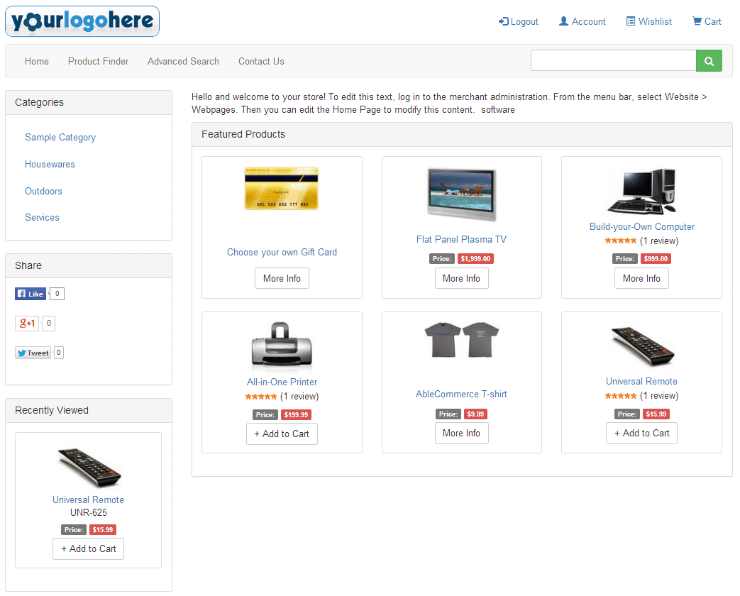
Example 1: Full Screen (shown with a large monitor)
Notice the left-column content remains in place. This responsive layout is still taking advantage of the extra large screen available.
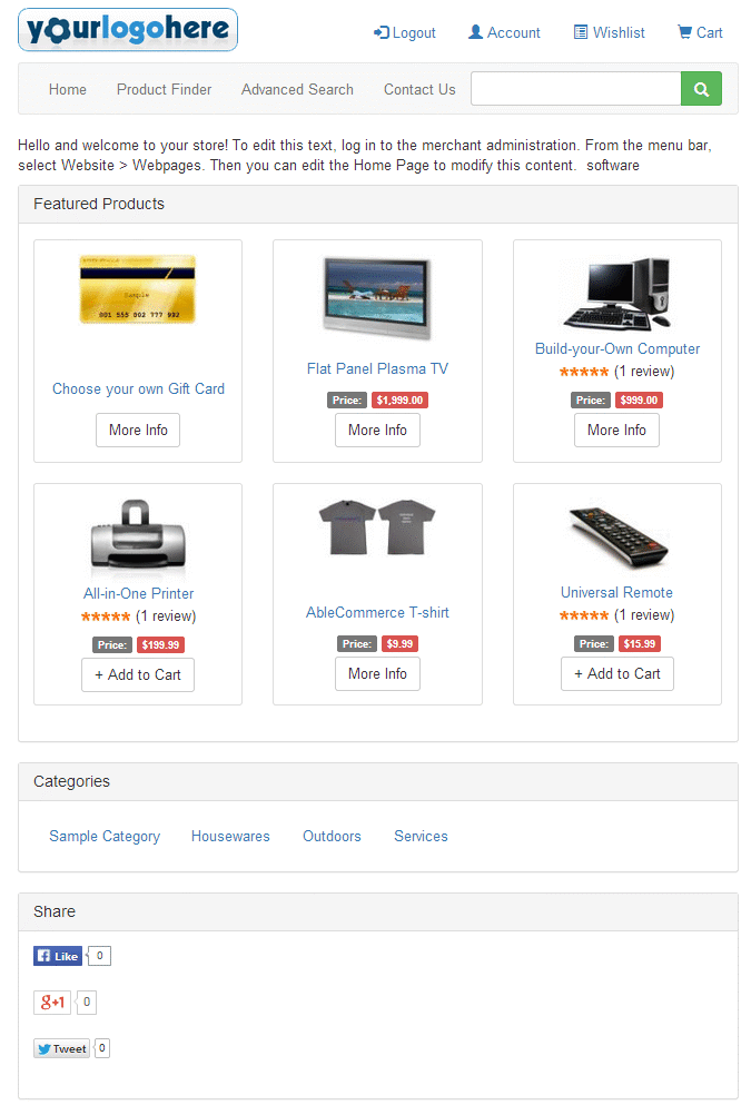
Example 2: Mid-sized Screen (like an Ipad or similar device)
Notice the left column content is automatically moved beneath the main screen content. This trait is specific to the LeftSideBarResponsive layout. If you prefer, you can use the LeftSideBar layout and the content being displayed in the left-column will appear BEFORE the main content of the page.
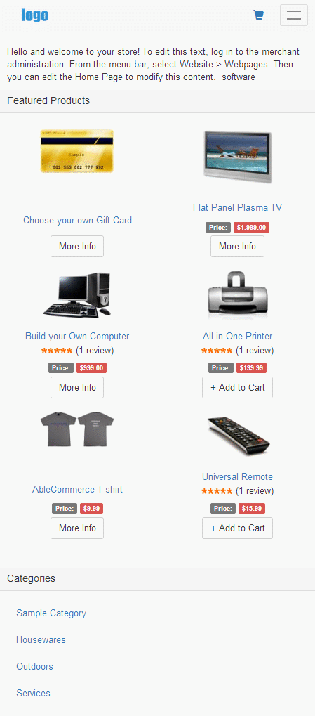
Example 3: Small Screen (like a mobile phone device)
Notice that the store header has changed so we can display as much content as possible on the page. By using a different store header, even the smallest mobile device will be able to view much more information without the added space used by the header.
If you have any feedback, comments, or suggestions, please use the green FEEDBACK tab found on any page within AbleCommerce Merchant Menu.
Go to Site Map