Website > Layouts > Default Product Page
In this Topic Show
Default Product Page
The Product Pages are designed to work with the products you have created in your store. A product page is the final display template that combines a Layout, Theme, and particular output format for the attributes of your product. You will set a default product display page. This is used for every product in your store, unless the product has a different assigned display page.
The different product pages can display product information in row, side-by-side, and in a grid, depending on your selections. For deeper customizations, simply copy one of the existing product page controls, make it your own, and then reference it within any product page.
Setting the Default Product Page
-
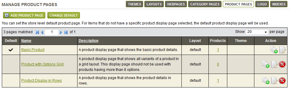
From the Manage Product page, or from the top-menu, go to Website > Product Pages.
-
In a default installation, there will be product display templates already defined. These are shown below.
-
The first column Default indicates which of the Product pages is currently set as the default.
-
Next, the Product Display Page Name and a brief description of the what will be shown on the page.
-
For each Product display page, you can either use the default product Layout or change each one to a different layout.
-
In the Products column, a linked counter is shown. This will lead you to a page where you can view and assign Product Display pages to the actual products in your catalog.
-
In the next column named Theme, a blank value indicates the default store theme is being used. You can set a different theme for each product display page.
-
In the last column, you can use the action icons to Copy, Edit, or Delete a display page.
-
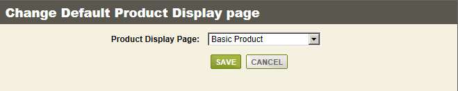
To change which product page is set to default, simply click the CHANGE DEFAULT button at the bottom of the list.
-
A pop-up form will appear. Select a different page from the list.
-
Click SAVE when finished.
Add a New Product Page
-
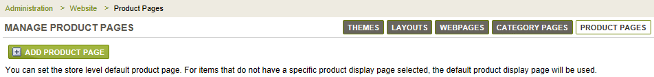
From the Manage Product page, or from the top-menu, go to Website > Product Pages.
-
Click the ADD PRODUCT PAGE button to create a product display template from scratch. Or, use the COPY icon for one of the existing display pages. In our example, we will make a copy of an existing template.
-
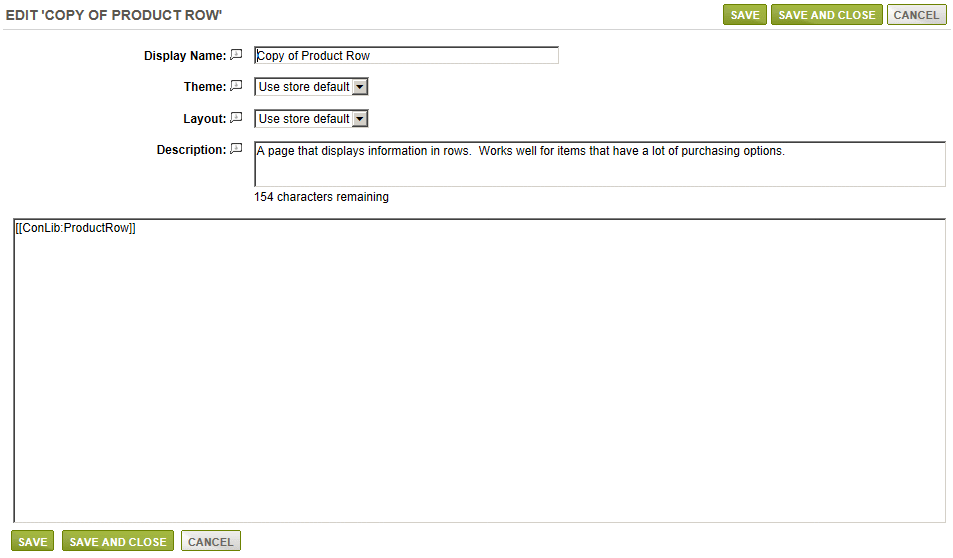
Immediately after clicking the COPY icon, a new display page will appear in the list. Click the EDIT icon to view a page similar to the following:
-
In the first field, enter a new or different Display Name for your product page.
-
For the next selection, you can pick a different Theme or use the store's default setting.
-
Select a Layout for this display page, or use the store's default setting.
-
Enter a short Description of this display page. This is optional and for merchant display only.
-
In the large field, you will see something like [[ConLib:ProductRow]]. This is the control that outputs a list of products within the selected category.
You can surround the automated output by entering your own custom text into this field.
Or, you can use your own custom control by referencing a new name. The control files are found in the \ConLib\ folder. -
When finished, click the SAVE or SAVE AND CLOSE button.
Product Page Controls
There are three controls already setup for each of the product pages available. These controls are copied into the Product Display Page main field. This determines how each product page will be displayed when it is assigned to the products in your store.
Each control has parameters that can be changed. These can be used to change how your page looks or what information will be displayed. You can make copies of any product display page and modify the control parameters as needed. Then assign them to different products for an easy customization. You can also add your own HTML before or after the control which will be displayed on each product page that uses this display template.
Basic Product uses the "ProductPage" control with standard compact layout using tabs.
[[ConLib:ProductPage OptionsView="DROPDOWN" ShowVariantThumbnail="False" ShowAddAndUpdateButtons="False" ShowPartNumber="False" GTINName="GTIN" ShowGTIN="False"]]

Product with Options Grid also uses the "Product Page" control with a TABULAR view for products that use options only.
[[ConLib:ProductPage OptionsView="TABULAR" ShowVariantThumbnail="False" ShowAddAndUpdateButtons="False" ShowPartNumber="False" GTINName="GTIN" ShowGTIN="False"]]
Product Display in Rows uses the "ProductRow" control with a horizontal row layout for products that have a lot of information to display.
[[ConLib:ProductRow OptionsView="DROPDOWN" ShowVariantThumbnail="False" ShowAddAndUpdateButtons="False" ShowPartNumber="False" GTINName="GTIN" ShowGTIN="False"]]
|
ProductPage and ProductRow Control Properties |
||
|
Parameter |
Description |
Possible Values |
|
OptionsView |
Indicates whether the product options will be displayed as dropdowns or you want to show variants in a grid. |
DROPDOWN or TABULAR |
|
ShowVariantThumbnail |
If true thumbnails will be shown for variants. This setting only works for 'TABULAR' view. |
True or False |
|
ShowAddAndUpdateButtons |
If true inventory is add button will be shown while editing basket items |
True or False |
|
ShowPartNumber |
If true Part/Model number is displayed |
True or False |
|
GTINName |
Indicates the display name. |
GTIN, UPC, or ISBN |
|
ShowGTIN |
If true GTIN number is displayed. |
True or False |
You can go to Help > ConLib Reference page to find the control and see a description for each of it's options.
Go to Site Map