Mobile Store Settings
Mobile shopping is on the rise, and will likely surpass shopping from the personal computer. Increase new sales and provide your customers a better shopping experience by giving them alternate mobile view of your store.
In the AbleCommerce Gold R2 version, a new mobile store will be activated automatically when a mobile device is recognized. The user is instantly switched over to a smaller, more navigable version of your store that makes it easier to view products and create a simple order.
Due to the complexity of some features, like shipping items to multiple addresses, the current version of the mobile store templates do not support them.
NOTE: AbleCommerce Gold R10 now includes a Responsive Website Theme. If you do not want to maintain a separate mobile store, then a Responsive theme may be something you wish to use instead.
Mobile Store Status
-
From the Configure Store page or using the top-menu, go to Configure > Store > Mobile Settings.
-
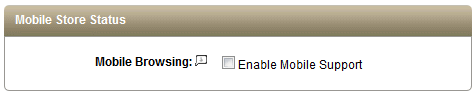
Find the Mobile Store Status section as shown below.
-
By default, Mobile Browsing will be disabled. When this feature is enabled, without the Responsive theme, then your customers will be accessing the /mobile/ store with a mobile device.
If the Responsive theme is in-use, then mobile support is not applicable. -
Click the SAVE SETTINGS button when finished.
Catalog Display
These are the settings to control display elements.
-
From the Configure Store page or using the top-menu, go to Configure > Store > Mobile Settings.
-
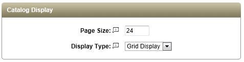
Find the Catalog Display section as shown below.
-
The value entered for Page Size determines the number of items to be displayed on category pages containing multiple listings.
Navigation to each additional page will be enabled as needed. -
The Display Type setting allows you to change between a Grid Display (columns and rows) or a Row Display only.
-
Click the SAVE SETTINGS button when finished.
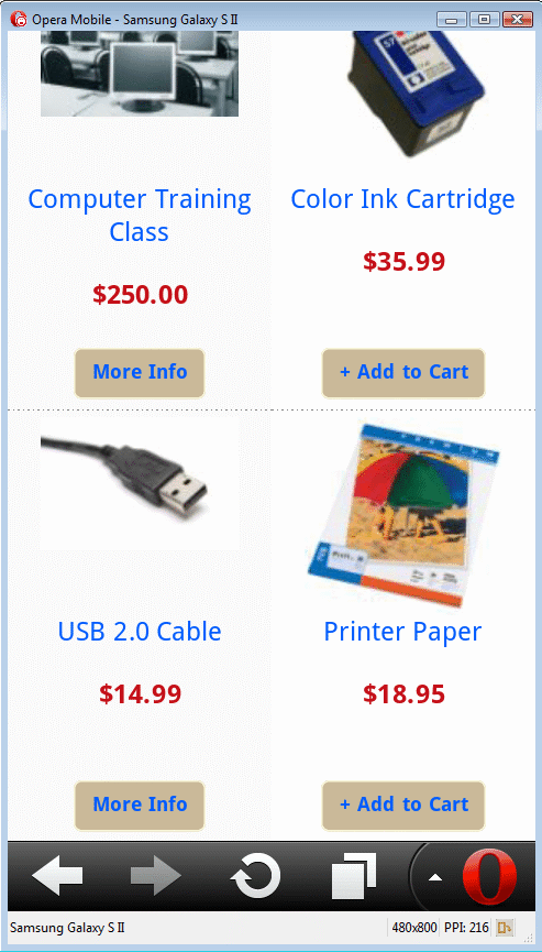
Here is an example of the Grid Display on a mobile device emulator:
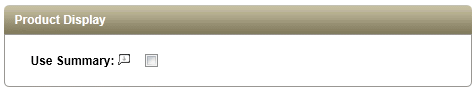
Product Display
-
From the Configure Store page or using the top-menu, go to Configure > Store > Mobile Settings.
-
Find the Product Display section as shown below.
-
To use a product's Summary description instead of the Standard description, check the box next to Use Summary.
-
Click the SAVE SETTINGS button when finished.
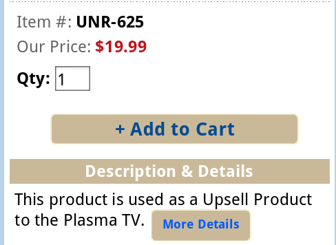
The Summary description and Standard descriptions from the Product Editing page:
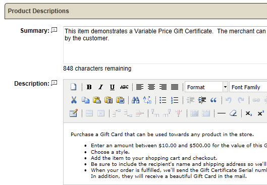
When the Summary Descriptions are used, the mobile user may have a MORE INFO button available to take them to the full Standard description.